Back to portfolio
Stacked Discounts Campaign Design Process
MAYSON COSMETICS ·
Brief
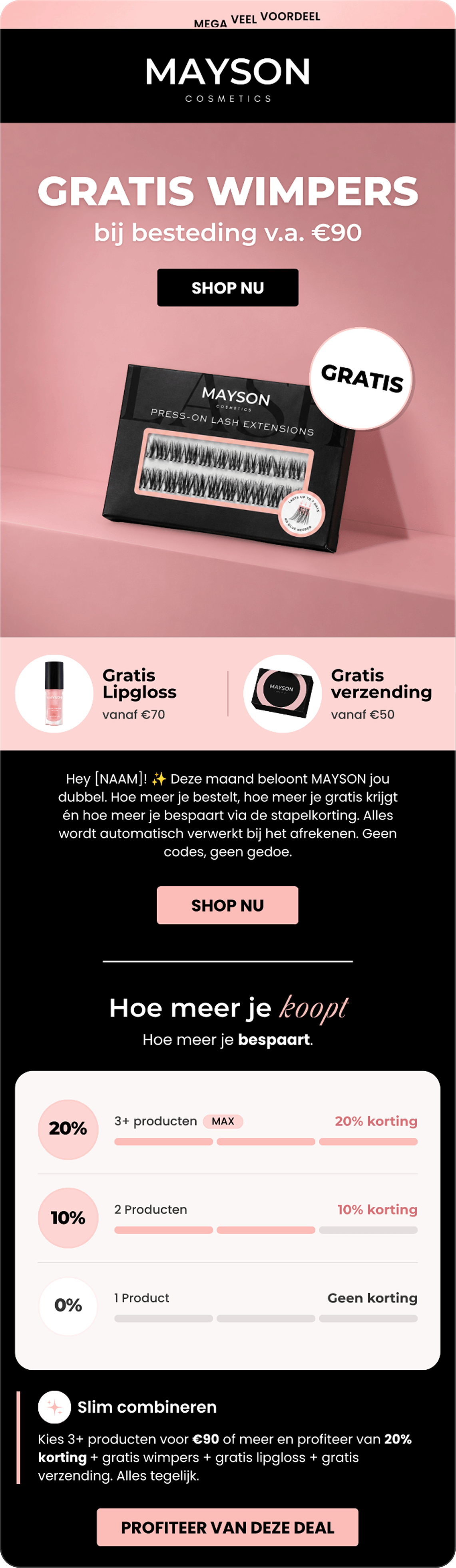
The brief asked me to “communicate a stacked discount using a progress bar.”

Design Decision
I noticed that the offer had three purchase tiers, so I divided the progress indicator into three segments and paired each tier with an explicit product count and discount label.

I designed the discount guide to:
- Make the thresholds visible at a glance.
- Make the tiers easier to scan.
- Connect each quantity to its discount.
Display order: Highest savings first
- 20% — Highest
- 10% — Middle
- 0% — Lowest
I also changed the order of the tiers. Instead of starting with 0% and building up to 20%, I placed the highest discount first.
My intention was to make the strongest benefit visible immediately, then let readers compare the smaller tiers below it.
For the rest of the email, I kept each section focused on one main message: the free-gift offer, the discount structure, a suggested combination of benefits, and product discovery.
Clear headings and calls to action helped organize the information into a straightforward shopping journey.
Final Campaign Visual